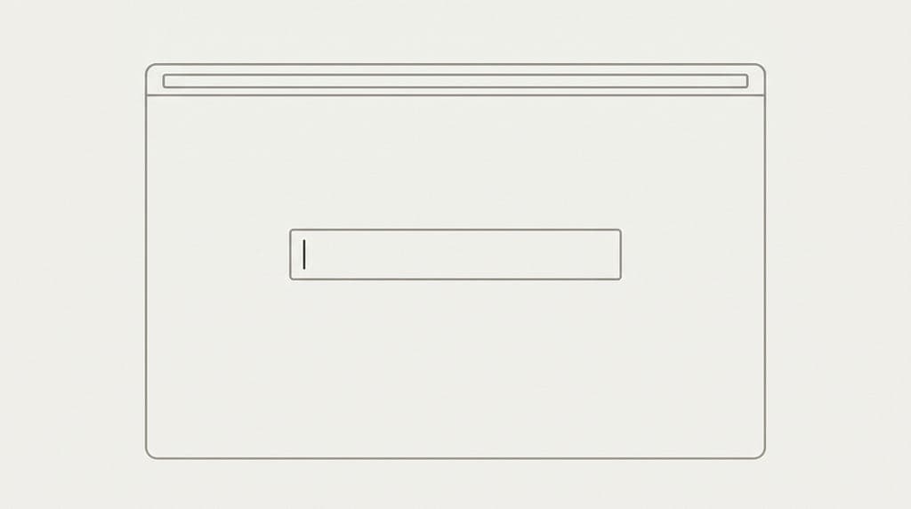
AI products killed 20 years of empty-state design and replaced it with a blinking cursor. A Chrome extension co-built by the author loses 70% of new installs after the first session. The culprit is not the model, not the onboarding flow, not the value proposition. It is the empty state: a centered text field, placeholder copy reading 'Ask me anything,' and four suggestion chips. ChatGPT, Claude, Gemini, Copilot, Cursor, Perplexity, Grok, and Mistral's Le Chat all ship the same screen. This was not minimalism. It was a design phase that never happened.
The article is worth reading in full because it does something most UX criticism skips: it shows the receipts. The author ran A/B tests. Versions showing a populated example, a completed artifact, or a sample result drawn from the user's own data outperformed blank-field versions by margins that, as the author puts it, any 2010-era growth team would have shipped as the only variant. The piece also traces the intellectual lineage of the failure, citing Don Norman's signifier theory, Nielsen Norman Group's empty-state guidelines, Bret Victor's 2006 'Magic Ink' essay, and Kathy Sierra's Suck Threshold concept. The argument is not aesthetic. It is structural: an empty surface with no signifiers is, by Norman's definition, broken.
The fix is not complicated, and the article names it precisely. Notion's current empty state ships three starting verbs, six worked template examples, and 'Build with AI' as one option of three. That is the benchmark. The author's retention data shows the cliff lives between install and second session, not at the model layer. First-week retention curves for AI products follow a predictable shape: steep drop after session one, long flat tail, a small power-user cohort driving the engagement numbers in the launch post. The empty state is where that cliff is built. The piece ends with a vocabulary of design patterns the industry abandoned when it accepted the prompt box as a paradigm rather than a placeholder.
[READ ORIGINAL →]